There's a pitch buried inside every app update, every redesigned checkout flow, every 'we've made things simpler for you' changelog entry. It sounds like generosity. It feels like progress. But once you start looking at what's actually being removed when tech gets 'seamless,' a different story emerges — and it's not a flattering one for the companies telling it.
The story is this: friction is power. And they're taking yours.
What Friction Actually Does
In UX design, friction refers to anything that slows a user down — an extra confirmation screen, a mandatory pause, a deliberate speed bump between intent and action. For decades, the industry gospel has been to eliminate it. Fewer taps. Fewer clicks. Less thinking. The assumption baked into this philosophy is that resistance equals frustration, and frustration equals failure.
But that assumption conveniently ignores something: friction is also where consciousness lives.
Think about the last time Amazon's one-click purchase fired before you'd fully decided you wanted something. Or the moment you realized you'd been scrolling Instagram for 45 minutes without ever choosing to keep going. Or the quiet horror of discovering a subscription auto-renewed for the third year in a row on a service you forgot you had. These aren't accidents. They're outcomes that were engineered — deliberately, methodically, by teams of designers and behavioral scientists whose job is to reduce the gap between your impulse and your wallet.
The micro-moment where you pause, reconsider, and potentially opt out? That's the moment they're designing away.
The Behavioral Science of the Bypass
This isn't conspiracy thinking. It's documented practice with a name: choice architecture. Companies like Meta, Amazon, and Google employ specialists in behavioral economics whose explicit goal is to structure digital environments so that the path of least resistance leads directly to their preferred outcome — more engagement, more purchases, more data.
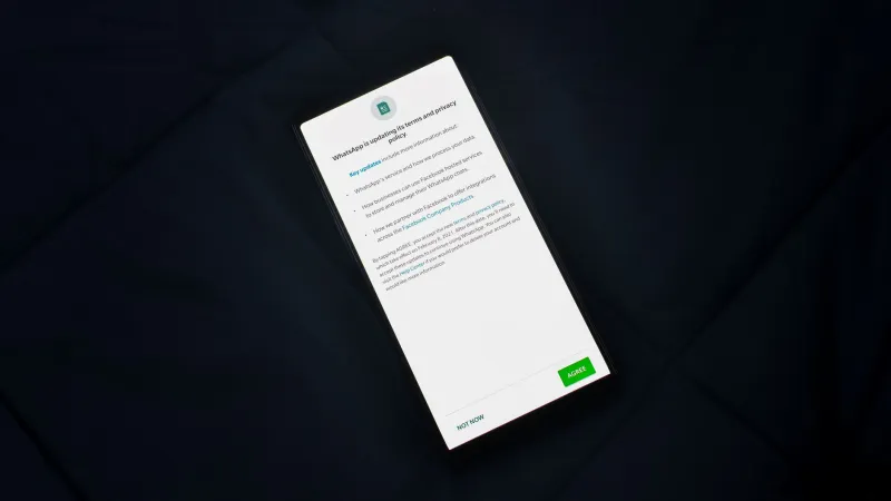
Dark patterns are the crude version of this: pre-checked subscription boxes, 'decline' buttons written in gray 6-point font, cancellation flows that bury the exit behind five screens of emotional manipulation. But the more sophisticated version is subtler. It's infinite scroll that never offers a natural stopping point. It's autoplay that assumes you want the next episode before the credits finish rolling. It's a checkout that remembers your card, your address, your preferences — every bit of stored information another layer of insulation between you and the word 'no.'
None of these features were designed for your benefit. They were designed to reduce what the industry calls 'drop-off.' Your hesitation is their problem. Your second-guessing is their loss. So they sand it down.
The Autonomy Argument
Here's where this gets political, and No Grip isn't going to apologize for that. The progressive case for digital autonomy isn't just about privacy — it's about power. When corporations systematically strip the moments in which you exercise conscious choice, they're not just making your life easier. They're shifting the balance of agency in a commercial relationship that was already tilted heavily in their favor.
You cannot meaningfully consent to something you didn't consciously choose. And when the entire architecture of a platform is built to route around your deliberation, the concept of 'informed consent' starts to look pretty hollow. That matters whether we're talking about a $12.99 monthly charge or the slow accumulation of behavioral data that gets sold to advertisers, insurance companies, or political campaigns.
The frictionless experience isn't neutral. It has a direction. And that direction is always toward more of whatever the platform is monetizing.
What Intentional Friction Looks Like in Practice
So what do you actually do about this? The answer isn't to become a Luddite or throw your phone into the Potomac. It's to consciously reintroduce resistance where it's been removed — to treat friction as a tool rather than a problem.
Some practical starting points:
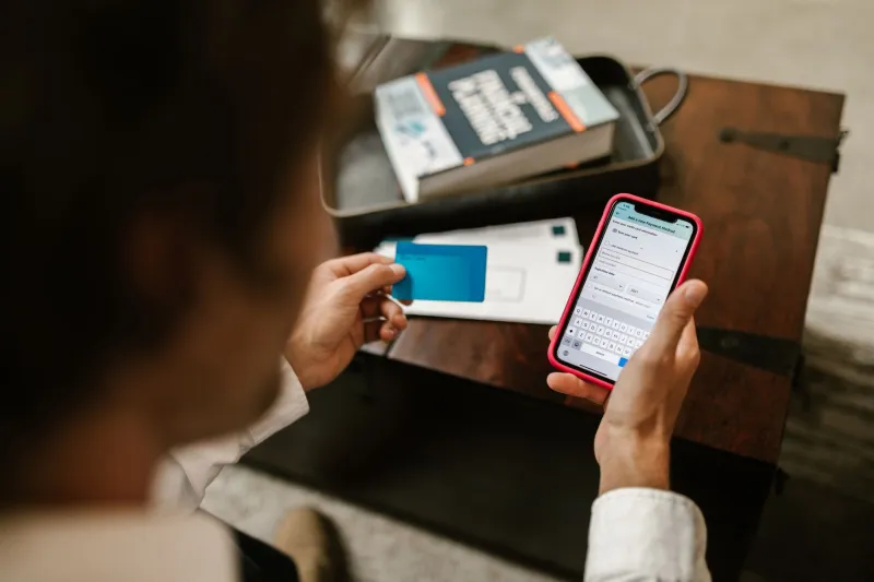
Kill one-click purchasing. Seriously. Remove saved payment methods from sites where you impulse-buy. Make yourself type the card number. That thirty-second inconvenience is a decision-making window, and it's yours.
Set app timers with teeth. Not the soft suggestions iOS and Android offer by default, which can be dismissed with a single tap. Use apps like ScreenZen or One Sec that introduce mandatory pause screens before you open high-engagement apps. The pause is the point.
Audit your auto-renews right now. Services like Privacy.com or your bank's subscription tracker will surface recurring charges you've forgotten. Cancel anything you can't immediately justify. Then turn off auto-renew on everything else and let the annual reminder become a genuine annual decision.
Use a browser extension to break infinite scroll. Unhook for YouTube, News Feed Eradicator for Facebook, or just Stylus with a custom CSS rule. When the feed ends, it ends. You decide what comes next.
Introduce a waiting list for purchases. One folder in your notes app. Anything over $50 goes on the list for 48 hours before you buy it. Embarrassingly simple. Surprisingly effective.
The Deeper Point
None of this is about being anti-technology. It's about recognizing that the design of your digital environment is not neutral, not inevitable, and not actually optimized for you. It's optimized for retention, conversion, and data extraction — and the smoothness you experience is the byproduct of that optimization, not its purpose.
When you reintroduce friction, you're not breaking something. You're reclaiming the space where your judgment used to live before someone decided it was inconvenient.
That space is worth protecting. And the fact that protecting it feels weird and effortful in 2025 tells you everything you need to know about how much ground has already been lost.
Grip back.